
The 5 Ugliest Uniforms in NFL History

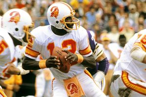
#5. While I don't hate them as much as other people do, the Tampa Bay Buccaneers' pumpkin-colored jerseys of the 1970s, 80s and early 90s were just downright silly. It didn't help that Tampa lost its first 26 games as a franchise and won one playoff game in 30 years while wearing them.

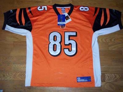
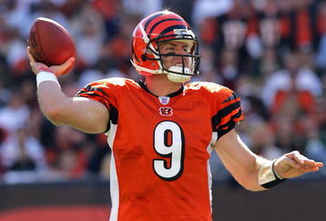
#4. Cincinnati Bengals "halloween" alternate orange jerseys. The Bengals have never had exemplary uniforms but these are the worst. I mean really, should you wear this to play football on Sundays or to go trick-or-treating? Bill Parcells once said that "All uniforms look good if you put good players in them," but even the able Carson Palmer cannot make this look good.

#3. The Denver Broncos of the 1960s were most famous for wearing striped socks, but let's also give fair mention to the comically bad helmets that the Broncos worn from 1962-1965.

#2. The road unis currently being sported by the Buffalo Bills are an atrocity on the eyes, and unnecessarily so. The Bills' classic blue-and-red color scheme should not have been corrupted this way, but sadly it has. Where do I begin? The block navy shoulder pads and clashing royal blue numbers that make this team look like an also-ran in the CFL? The dueling blue shades on the helmet? The red-and-blue piping up the pants that turn into garish straight red going up the side of the jersey? Hideous. And until last Sunday, the worst uniforms I'd ever seen in the NFL.
Then came...

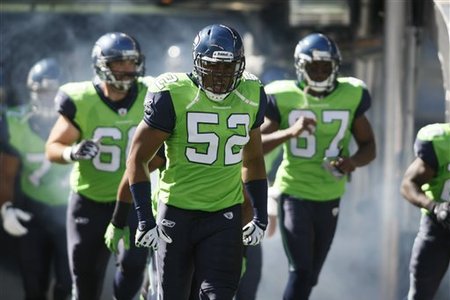
#1. The Seattle Seahawks green alternate jerseys. There's really no argument here. Even the XFL and the World Football League would not have tolerated this. Maybe the United Football League would, but that doesn't help Seattle's case. It's not just the electric green that makes them look like Power Rangers or Planeteers. It's the dull blue helmets clashing with the navy pants... or the dull blue piping virtually invisible against said pants... or the blue sleeves that make the jerseys look like one of those vests you wear in the woods during hunting season. A nightmare. An abject nightmare. And the matching shoes worn by some Seahawks on Sunday do not help.
Most alarming from this list is that 3 of these 5 aesthetic abominations are still being used by the franchises in question. Is it possible that football uniforms are getting worse? Several teams -- Minnesota, Jacksonville -- are currently sporting uniforms noticeably uglier than any they have had in their franchises' histories. And in college ball, things have just gotten wacky.
What is clear is this: in the NFL, old school is usually better. The best uniforms in the NFL are the ones that have undergone little or no change over many decades.
No comments:
Post a Comment